A good landing page is like creating an inviting entry link for your customers to enter your web page. You may run an online store and display the fleet of products you need to sell on a virtual platform. Else, you may provide value-added services to customers residing across the world. Either way, you need a good landing page so that web users are directed to your company's website every single time.
8 common mistakes to avoid when designing a landing page
Creating Multiple Call to Action Buttons
In the wake of wanting more consumers for your web-based store or business entity, you may have a tendency to include multiple call-to-action buttons. However, this is a strict no-no. This is mainly because you may end up distracting your customers when you add too many call-to-action buttons to your landing page. Have a more precise and standard call-to-action button that can exactly land web users towards your web page. This way, you will provide your web users with a more clear and more concise course of action.
Content that has been Poorly Written
Again, as you all must be aware, Content is the king or the lifeline of any business entity. Hence, when you try inserting keywords or adding excessive content on your home page or landing page, you may end up adding a big turn-off for the customers or web users who end up clicking on your business link.
Hence, you must never resort to badly formatted content. You can have shorter paragraphs that are broken down with product caricatures or infographics. You should also use enough words to grab a reader's attention.
Bad Typography
Now is the time for you to focus on a desirable eCommerce landing page design. To get this particular aspect streamlined, you must have your typography issues sorted out. Have a proper font size for your content and use a darker indented colour to highlight your content across a lighter background. When you create a copy that is too light or is of lesser font size, even if your content is too good, your web users may not be able to read or capture what is there on it. Again, you can use a background colour to suit the colour or shade of the typed-out letters. Using contrast shades can help you achieve the feat better. You must also test the background colour or images across all types of devices to see how compatible it is across multiple screens. Say for instance, across your desktops, laptops, tabs, smartphone screens, and so on.
Using Lower-quality Images
Are you more concerned with calculating the landing page design cost? Or are you wanting an impressive landing page for your enterprise or entity? Quality always measures higher over quantity or the pricing aspect of it. To have a high-quality eCommerce landing page design, this is an important factor for you to take into consideration. You must use higher-quality images for your content. You can take yearly subscription packages from Instagram or Pinterest so that you get high-resolution images for your content.
Most of the web users who land your business page are in a hurry. Hence, when you provide an authentic set of images that mirrors your content, you can make your brand or offer more enticing or exciting for your customers after all.
Not Creating Attractive offers and also asking for too much Personal info
Do you create mediocre offers and ask for too much personal info once the web visitors hit your landing page? Well, this can be a blunder for building your brand or business entity. When you ask a member to give his/her name, email id and the country he/she resides in, customers feel that you are asking for too much. You must also create interesting offers when you want to lure web users by giving away their names, email addresses, and other forms of demographics. Say the landing page offer can be
'Subscribe to our web page and get an instant 10% off on our Premium range cookies pack'.
If the offer is as compelling as this, then members will not mind giving their info or details you are looking for.
Cluttered or Complicated Page Layouts
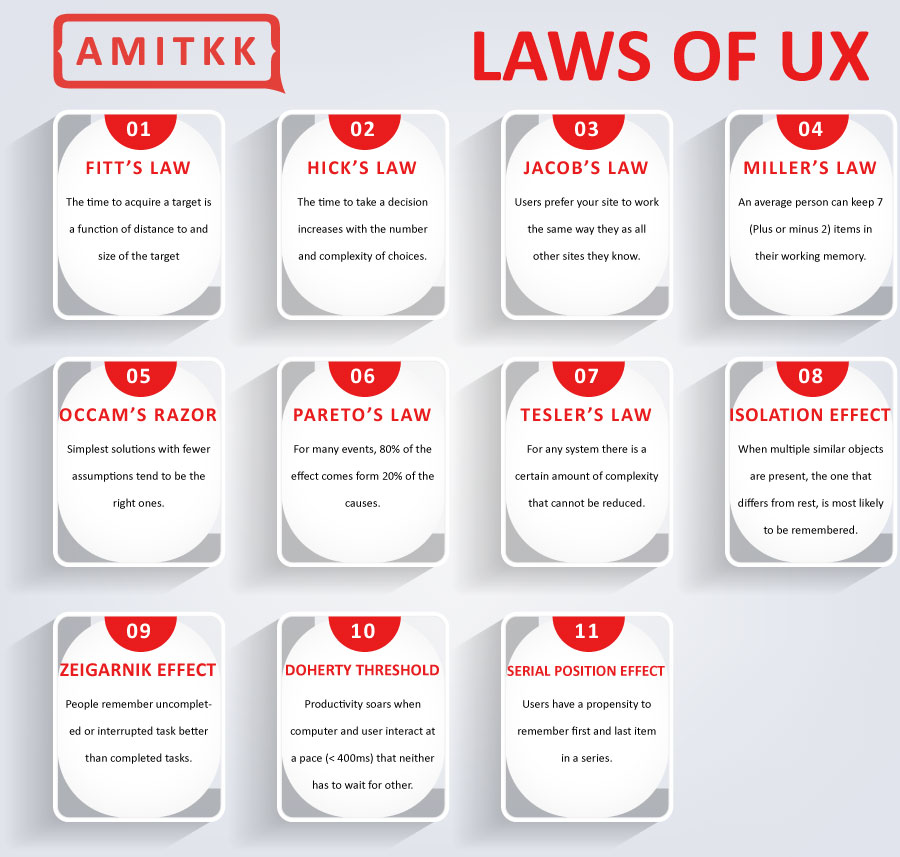
Again, you must understand the major difference between a landing page and a website. A web page is something a member will get into once he/she likes the landing design. Whereas, the landing page is like the first spot a web user gets on to even before he/she gets to know you or the brand you are into. Hence, when you create a landing page initially, you must aim to provide navigability for your members or web users at a quality that is at its best. When you provide cluttered page layouts, this can be a big turn-off for your web users after all. Web users read content from left to right and from top-to-bottom. When you insert upside-down content or have swirling image backgrounds, this can be turn-offs or distractions for web users wanting to click on your user link, aka, the landing page of your site!
Slower Page Loading
Studies reveal that when a landing page takes 3 extra seconds to open, the visitors move on to the next business page. Statistically, a company can lose 47% of business if its landing pages load up slowly. Hence, to have a robust landing page, with more network or web traffic, you must have a landing page with faster loading speeds. Not just that, the web page or templates must also load up faster through other digital devices like I-pads, Chromebooks, smartphones, tablets, desktops and laptops. To notch a perfect eCommerce landing page design, you can contact a reputed web developer or website development agency at the earliest.
Redirects not Used
Sometimes, you may use a parent site with the URL for its landing page. But if you are renovating the site or if the site is under maintenance, if you do not use redirect links, then it shows '404 Error- page not found as the pop-up notification. You can use a '303 redirect option' instead so that they are diverted to the page you have selected for members to work on.
Conclusion
These are 8 common mistakes to avoid when designing a landing page. Pointers have also been provided to you on how to get the mistakes rectified and work on landing a fab page on the very first go!



 Website Designing Company In Delhi
  Ecommerce Website Development In Delhi
  Wordpress Website Development
  React Development Company
  Ecommerce Seo
  Quora Marketing
  Technical Seo
  Website Development In Bangalore
  Seo Company In Jaipur
  Website Development In Jaipur
  Wordpress Development In Ahmedabad


